2/22
I finished my Ensley Project! - I am only calling it the 'Ensley Project' because I don't have a name for it. Overall, I'm extremely unsatisfied by the project, but I am not disappointed because I pretty much knew that I wouldn't reach my goal in this project. It was really complicated but I don't think my time went to waste-- I love the concept and also, now that I have done it once, I think I know how to do it correctly! If I did this project one more time, I think it would turn out much, much better. I know how to improve, but there are some things I don't really know how to correct. Yet I digress.
The entire idea of this project was the play with light and layers. Basically, I divided her face by tone. I labeled the lightest tones in her picture by '1' and the second darkest as '2' and so on. I ended up going all the way up to about 8 I believe. Afterwards, I started painting. I used the same color of diluted black acrylic paint in every layer-- the only thing that determined how light/ dark the paint came out was the layer that they were put in. I painted the lightest layer first (number 1), let it dry, and then painted a couple thin layers of white gesso over it. I repeated the process with all the numbers except for the last one. I have no idea if that makes sense to anyone, because the project is actually really complicated and even I had a lot of trouble with both explaining and making the painting.
Here are some pictures.
If I were to do it again, I would use gray instead of black. I think black was too dark and I ended up diluting it, which made uneven shades. Also, if I had used straight black like I originally intended, it would have been too dark and it would have taken several several layers of white gesso to cover it up. It also just feels too dark, which messed me up. Maybe I would make the last layer (the layer I don't cover up) black, though.
I would also use several different layers of tracing paper (according to the numbers..so there would be one layer of tracing paper for each number) so it would be like a physical representation of the layers. For this project, I used one sheet of tracing paper for the entire project and I found that it became very messy and complicated, especially because I was continually marking it each time I was working on a layer.
In addition, I would not separate the layers like I did. Instead, I would build on it. For example, for the first layer, I would not only paint the places I marked as '1,' but I would also paint every other layer (1, 2, 3, 4, 5, 6, 7, 8). For the second layer, I would paint every number from 2 and up. I would continue this with every number/layer so that the tone would be more distinguished and dark.
Lastly, I would make the edges softer. I need to blend, blend and blend. In this project, I cut everything into shapes depending on the shade which really distorted Ensley's face. I should have made the shadows flood into her face and fade away like the real image. I feel like the only reason I didn't blend was because I didn't really know how, especially because I'm not just straight blending: I'm blending one layer to another, and it's hard when you don't have the things your blending together (in the same place). But I think I know how to do it now. You kind of just fade out instead of making straight, abrupt edges.
That's it.
Bye
Tuesday, February 23, 2016
7 ADV ART & PORTFOLIO - Keng Lye
Keng Lye is an singapore-based artist that deals with layering and painting! He uses resin and acrylic paint to create realistic works of underwater animals. He calls this series "Alive Without Breath".. which is actually really fitting. Check it out:


1.

2.

3.

4.

5.

OKAY i think this is really cool because these are paintings that aren't 2D-- he makes these works by pouring in thin layers of clear resin, letting it dry, and then painting on it. He does this over and over again to create realistic animals in anything ranging from drawers to bowls to buckets. Another thing that's cool is that he even started experimenting with the animals protruding from the 'water.' The one below is the first one that he's finished:
6.

The concept that he deals with is almost the same as mine as I paint realistically (well, I TRY to paint realistically. Doesn't really work out) layer after layer after layer.
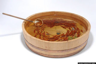
Keng Lye gets his inspiration from Riusuke Fukahori, the artist that first developed the method of using clear resin & painting on layers of it. He calls himself a goldfish artist. Here's some of his works:
7.

8.

These are crazy good. The process seems excruciating but the result is amazing. I love how they're using layers to take several units of 2D art to make one unit of something 3D! I explored a similar concept with the Ghost Ship project where I painted different paintings on several layers of translucent tracing paper and put them together to make one piece of art. I hated it and it came out awful but I'm really intrigued by the concept! I want to try again and make something better with the same methods.
Links:
- http://www.hongkiat.com/blog/alive-without-life-art/
- http://www.dailymail.co.uk/news/article-2359197/Artist-creates-stunning-3D-paintings-fish-using-layers-paint-resin.html
- https://www.artsy.net/artist/riusuke-fukahori << This one's on Fukahori
Monday, February 8, 2016
6 ADV ART & PORTFOLIO - Paul Jackson
Paul Jackson is an artist in Toronto who creates realistic drawings of animals, but with a twist. He draws the animals with emerging internal anatomy, yet he is careful to leave out their organs and prevents his works from looking like roadkill.


1.

I love how the artist stretches the animal's skin like this-- in an unrealistic way.
But the skull and the animal itself is realistic. And although the animal's
gooey skin is obviously unrealistic, he makes it look like it is natural.
2.

3.

4.

this one's my favorite
5.

This artist piqued my interest because he deals with the concept of realism blended with abstraction. Every animal he draws includes hyper-realistic details, yet he changes the entire drawing by adding the inner anatomy of the animals, creating a sinister effect, leaving the viewer surprised. This is the same general concept I'm dealing with-- blending realism with abstraction. I want to ultimately make the viewer think about my work and the conceptual aspects of it because of the abstraction that is instilled in the piece.
Links:
- https://instagram.com/pauljacksonlives/
- http://wisdomchokeyou.tk/post/136223823588/culturenlifestyle-stunning-dark-drawings-of
Subscribe to:
Comments (Atom)