I'm back to traditional paintings! Well traditional in the sense that there isn't anything noticeably off when you first see it. It's basically a portrait but front and back.
The painting is going to be of Medusa, before and after she was cursed to have snakes as hair. I don't really want to go into the story in depth because 1) I already did research on this and there's actually like ten different versions of the story about why/how she got the snakes and 2) I haven't chosen which one of the versions I want to influence my art, if I choose any at all. So I don't really want to give the background of the story because it may give you some unintentional meaning to my work which, I usually encourage, but this time the message is pretty straight-forward: I'm just portraying a Greek Mythology story using acrylic paint, a play with light, and a pretty girl.
Ok, so here's how this plays into everything else that I'm doing: It's a play with light. Basically, on the front of the substrate, I'm going to paint Medusa (before the curse) on the front, and Medusa (after the curse.. aka with the snakes) on the back of the substrate. But the portrait on the back will be flipped, so that Medusa's features correspond with the front. The pictures will (hopefully) collide in unity when a strong light hits it.
The only thing about this is that there is absolutely nothing about negative space in this project, which was included in my artist statement (and I was hoping it could be part of my concentration) so I'm a little stuck there. But it does follow through with the light part-- light does play a serious part in this piece. Maybe I should just change my artist statement / concentration. I absolutely do NOT plan on dropping the concept of negative space, though. I have too many ideas for that.
Although I actually did plan on doing this project a very long time ago, I didn't think that I would be doing it now. The only reason I'm doing it right now is because I need a break from doing layers. Layering is really complicated, and I didn't enjoy dealing with layering two projects in a ROW, which, both of them turned out awful. So I'm really looking forward to this one! Especially because this project is really what gave birth to basically ALL my other light/layering ideas. I thought about this painting a really long time ago, and because of it, I suddenly got more and more ideas about light and hidden paintings, which basically led to negative space and layering. So this is kind of like my first step but I'm doing it as my fourth step aha.
Monday, March 14, 2016

10 PORTFOLIO - Secret Garden Idea
The next project I'll be working on is going to be titled "Secret Garden"! WHICH IM REALLY EXCITED ABOUT BECAUSE I USUALLY NEVER HAVE A TITLE FOR MY ARTWORK but for this one I do!!
Okay well anyways, this is going to be more negative space stuff. Basically, what I'm going to do is that I'm going to take different slabs of wood and paint on the side. I'll place them strategically and then arrange it so that the different paintings on each side comes together. It's a little hard to explain-- not because the concept is complicated, I'm just bad at explaining things. But anyways I'm excited! Mrs. Miller and I already cut the wood which is absolutely beautiful. Here are some pictures of it because I am in LOVE with the wood.


Okay well anyways, this is going to be more negative space stuff. Basically, what I'm going to do is that I'm going to take different slabs of wood and paint on the side. I'll place them strategically and then arrange it so that the different paintings on each side comes together. It's a little hard to explain-- not because the concept is complicated, I'm just bad at explaining things. But anyways I'm excited! Mrs. Miller and I already cut the wood which is absolutely beautiful. Here are some pictures of it because I am in LOVE with the wood.
1.

2.

you can see the sap in the wood
3.

I LOVE THE RINGLETS!! they're so pretty
4.


Tuesday, March 1, 2016
9 ADV ART & PORTFOLIO - Ghost Ship
For this project, we listened to Sonic Escape's "Ghost Ship" and painted based on what we heard. What I did was that I listened to the music, and separated them into different sections depending on the tone of the music. Then, I took different layers of tracing paper and painted different images on each of them (corresponding to the different tones I heard in the music) using watercolor. I put them all together using glue spray adhesive, but the images didn't all come together like I thought it would. The piece was translucent and it was supposed to come all together when the light hit it. Another problem that I had was that the pieces of tracing paper that I used was so big that when they were put all together, they became wrinkled, which didn't help because the paper was already pretty wrinkled from the water from the water color (I ended up ironing the tracing paper before I glued them together)
Overall, I did not like the project at all. This is also a project that was more on the abstract side, and I'm used to being very detailed so I wasn't satisfied with the outcome (yet the process of doing this project was fun!). But I love the concept of it! The layering reminds me of the Ensley project except much, much easier and the substrate I painted on was good because it was translucent. I would love to do this project against but on a smaller scale and maybe with a different medium, so that the paper wouldn't wrinkle. But right now I want to take a break from layers ahaha. I'm so tired.
Here's a picture .. it was accidentally taken from the back but I actually don't mind
Overall, I did not like the project at all. This is also a project that was more on the abstract side, and I'm used to being very detailed so I wasn't satisfied with the outcome (yet the process of doing this project was fun!). But I love the concept of it! The layering reminds me of the Ensley project except much, much easier and the substrate I painted on was good because it was translucent. I would love to do this project against but on a smaller scale and maybe with a different medium, so that the paper wouldn't wrinkle. But right now I want to take a break from layers ahaha. I'm so tired.
Here's a picture .. it was accidentally taken from the back but I actually don't mind
Tuesday, February 23, 2016
8 ADV ART & PORTFOLIO - Ensley
2/22
I finished my Ensley Project! - I am only calling it the 'Ensley Project' because I don't have a name for it. Overall, I'm extremely unsatisfied by the project, but I am not disappointed because I pretty much knew that I wouldn't reach my goal in this project. It was really complicated but I don't think my time went to waste-- I love the concept and also, now that I have done it once, I think I know how to do it correctly! If I did this project one more time, I think it would turn out much, much better. I know how to improve, but there are some things I don't really know how to correct. Yet I digress.
The entire idea of this project was the play with light and layers. Basically, I divided her face by tone. I labeled the lightest tones in her picture by '1' and the second darkest as '2' and so on. I ended up going all the way up to about 8 I believe. Afterwards, I started painting. I used the same color of diluted black acrylic paint in every layer-- the only thing that determined how light/ dark the paint came out was the layer that they were put in. I painted the lightest layer first (number 1), let it dry, and then painted a couple thin layers of white gesso over it. I repeated the process with all the numbers except for the last one. I have no idea if that makes sense to anyone, because the project is actually really complicated and even I had a lot of trouble with both explaining and making the painting.
Here are some pictures.
If I were to do it again, I would use gray instead of black. I think black was too dark and I ended up diluting it, which made uneven shades. Also, if I had used straight black like I originally intended, it would have been too dark and it would have taken several several layers of white gesso to cover it up. It also just feels too dark, which messed me up. Maybe I would make the last layer (the layer I don't cover up) black, though.
I would also use several different layers of tracing paper (according to the numbers..so there would be one layer of tracing paper for each number) so it would be like a physical representation of the layers. For this project, I used one sheet of tracing paper for the entire project and I found that it became very messy and complicated, especially because I was continually marking it each time I was working on a layer.
In addition, I would not separate the layers like I did. Instead, I would build on it. For example, for the first layer, I would not only paint the places I marked as '1,' but I would also paint every other layer (1, 2, 3, 4, 5, 6, 7, 8). For the second layer, I would paint every number from 2 and up. I would continue this with every number/layer so that the tone would be more distinguished and dark.
Lastly, I would make the edges softer. I need to blend, blend and blend. In this project, I cut everything into shapes depending on the shade which really distorted Ensley's face. I should have made the shadows flood into her face and fade away like the real image. I feel like the only reason I didn't blend was because I didn't really know how, especially because I'm not just straight blending: I'm blending one layer to another, and it's hard when you don't have the things your blending together (in the same place). But I think I know how to do it now. You kind of just fade out instead of making straight, abrupt edges.
That's it.
Bye
I finished my Ensley Project! - I am only calling it the 'Ensley Project' because I don't have a name for it. Overall, I'm extremely unsatisfied by the project, but I am not disappointed because I pretty much knew that I wouldn't reach my goal in this project. It was really complicated but I don't think my time went to waste-- I love the concept and also, now that I have done it once, I think I know how to do it correctly! If I did this project one more time, I think it would turn out much, much better. I know how to improve, but there are some things I don't really know how to correct. Yet I digress.
The entire idea of this project was the play with light and layers. Basically, I divided her face by tone. I labeled the lightest tones in her picture by '1' and the second darkest as '2' and so on. I ended up going all the way up to about 8 I believe. Afterwards, I started painting. I used the same color of diluted black acrylic paint in every layer-- the only thing that determined how light/ dark the paint came out was the layer that they were put in. I painted the lightest layer first (number 1), let it dry, and then painted a couple thin layers of white gesso over it. I repeated the process with all the numbers except for the last one. I have no idea if that makes sense to anyone, because the project is actually really complicated and even I had a lot of trouble with both explaining and making the painting.
Here are some pictures.
If I were to do it again, I would use gray instead of black. I think black was too dark and I ended up diluting it, which made uneven shades. Also, if I had used straight black like I originally intended, it would have been too dark and it would have taken several several layers of white gesso to cover it up. It also just feels too dark, which messed me up. Maybe I would make the last layer (the layer I don't cover up) black, though.
I would also use several different layers of tracing paper (according to the numbers..so there would be one layer of tracing paper for each number) so it would be like a physical representation of the layers. For this project, I used one sheet of tracing paper for the entire project and I found that it became very messy and complicated, especially because I was continually marking it each time I was working on a layer.
In addition, I would not separate the layers like I did. Instead, I would build on it. For example, for the first layer, I would not only paint the places I marked as '1,' but I would also paint every other layer (1, 2, 3, 4, 5, 6, 7, 8). For the second layer, I would paint every number from 2 and up. I would continue this with every number/layer so that the tone would be more distinguished and dark.
Lastly, I would make the edges softer. I need to blend, blend and blend. In this project, I cut everything into shapes depending on the shade which really distorted Ensley's face. I should have made the shadows flood into her face and fade away like the real image. I feel like the only reason I didn't blend was because I didn't really know how, especially because I'm not just straight blending: I'm blending one layer to another, and it's hard when you don't have the things your blending together (in the same place). But I think I know how to do it now. You kind of just fade out instead of making straight, abrupt edges.
That's it.
Bye
7 ADV ART & PORTFOLIO - Keng Lye
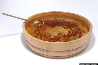
Keng Lye is an singapore-based artist that deals with layering and painting! He uses resin and acrylic paint to create realistic works of underwater animals. He calls this series "Alive Without Breath".. which is actually really fitting. Check it out:


1.

2.

3.

4.

5.

OKAY i think this is really cool because these are paintings that aren't 2D-- he makes these works by pouring in thin layers of clear resin, letting it dry, and then painting on it. He does this over and over again to create realistic animals in anything ranging from drawers to bowls to buckets. Another thing that's cool is that he even started experimenting with the animals protruding from the 'water.' The one below is the first one that he's finished:
6.

The concept that he deals with is almost the same as mine as I paint realistically (well, I TRY to paint realistically. Doesn't really work out) layer after layer after layer.
Keng Lye gets his inspiration from Riusuke Fukahori, the artist that first developed the method of using clear resin & painting on layers of it. He calls himself a goldfish artist. Here's some of his works:
7.

8.

These are crazy good. The process seems excruciating but the result is amazing. I love how they're using layers to take several units of 2D art to make one unit of something 3D! I explored a similar concept with the Ghost Ship project where I painted different paintings on several layers of translucent tracing paper and put them together to make one piece of art. I hated it and it came out awful but I'm really intrigued by the concept! I want to try again and make something better with the same methods.
Links:
- http://www.hongkiat.com/blog/alive-without-life-art/
- http://www.dailymail.co.uk/news/article-2359197/Artist-creates-stunning-3D-paintings-fish-using-layers-paint-resin.html
- https://www.artsy.net/artist/riusuke-fukahori << This one's on Fukahori
Monday, February 8, 2016
6 ADV ART & PORTFOLIO - Paul Jackson
Paul Jackson is an artist in Toronto who creates realistic drawings of animals, but with a twist. He draws the animals with emerging internal anatomy, yet he is careful to leave out their organs and prevents his works from looking like roadkill.


1.

I love how the artist stretches the animal's skin like this-- in an unrealistic way.
But the skull and the animal itself is realistic. And although the animal's
gooey skin is obviously unrealistic, he makes it look like it is natural.
2.

3.

4.

this one's my favorite
5.

This artist piqued my interest because he deals with the concept of realism blended with abstraction. Every animal he draws includes hyper-realistic details, yet he changes the entire drawing by adding the inner anatomy of the animals, creating a sinister effect, leaving the viewer surprised. This is the same general concept I'm dealing with-- blending realism with abstraction. I want to ultimately make the viewer think about my work and the conceptual aspects of it because of the abstraction that is instilled in the piece.
Links:
- https://instagram.com/pauljacksonlives/
- http://wisdomchokeyou.tk/post/136223823588/culturenlifestyle-stunning-dark-drawings-of
Sunday, January 31, 2016
5 PORTFOLIO & ADV ART - Kerby Jean-Raymond
Kerby Jean-Raymond is a Haitian American native New York fashion designer and founder of the menswear label Pyer Moss. During New York Fashion Week, the designer focused on the "Black Lives Matter" movement and police brutality in his spring collection by using video, street art (collaborated with Gregory Siff), and fashion.


1.

2.

3.

In his works, he refers to victims of police brutality such as Eric Garner ("I can't breathe"), a black male who was choked to death by a police officer. I love this artist for many reasons.
First off, the Black Lives Matter movement is something that is very dear to my heart. I am not black (lol, obviously), so I may not fully understand what these people have been through, but as part of the minority in the United States, I can relate to where these people are coming from in terms of stereotypes and racism. I also hold strong opinions about police brutality in our country. Again, I have never been directly targeted by the police but reading articles on this issue and being influenced by social media really makes it a seem like a serious problem to me. (Music has also influenced me a lot as well>> White Privilege II by Macklemore, C.O.P./Criminals Of Permission by J-Jon, etc.)
Secondly, I also think that this artist/designer was really hard-hitting with this collection. I love how the message was so explicit. There was blood representing violence/pain/murder/etc, words that reference to certain people, etc. Even the video he presented at the fashion show was graphic and straightforward: there were bodies lying in pools of blood, cops shooting at people, the choking of Eric Garner, a teenage girl being thrown to the ground, etc. There was not any second-guessing about the issue Jean-Raymond was addressing. His intent was clear.
Thirdly, This show was not just a fashion show, Jean-Raymond was presenting an argument. The designer said to the reporters after the show,
“It’s not for shock value, but it’s what’s going to make you think about this… after you go to three shows. What’s going to make you think about this again at 11 when you’re done for the day? That’s what it’s about.”
Fourthly, I like how it was a risk to do something like this, but he did it anyways. The designer actually confessed that he was initially unsure about actually presenting it to the public. And when he did, some fashion and front-row regulars were so upset they didn't even attend. But the designer stood his ground and asserted his opinion anyways.
Finally, I love this artist because he made it personal. His explicit art was on real life people (which basically made THEM part of the art as well) which is psychologically hard-hitting to many people, I'm sure. Also, he talks about his own experiences with police brutality. And yet, not only did he consider his opinions in his artwork, but he also considered the viewer's perspective while he was putting the entire thing together. Kerby Jean-Raymond reportedly said that he tried to gather the most gripping information possible for the 10-minute video he presented. He also used his own money/team to interview the family members of widely-known victims of police brutality (some clips were even included in the video) such as the daughter of Eric Garner, and the mother of Oscar Grant. But he didn't just stop there. He took it a step further by INVITING some family members of the victims to sit in the front-row seat of his show, which is a highly coveted position.
This artist executed his spring collection so flawlessly and studied it with such depth that even if you are on the other side of the argument, you can't help but to give him some credit.
WOw. I really didn't intend to ramble on about this topic but I feel like a lot of that was necessary to get to my main point. Here's the significance of this artist in relation to my own art: I basically aspire to be this kind of artist. Kerry Jean-Raymond took something that was very personal to him and presented it in a way so that many others could relate to him (geez, I'm Korean and after researching on his fashion show I took personal offense to all the incidents that have involved blacks and police brutality). He also made his fashion items very explicit in the message he was trying to send and by doing so, he took a major risk-- especially because the topic he addressed is such a controversial issue. For me, that's something I can't do very well because I'm so afraid of people not approving of my art and I'm also afraid that my opinion may alter someone else's opinion and essentially limit them to that ONE opinion instead of them coming up with their own conclusions (if that makes sense).. But the fact that he was brave enough to take something he felt strongly about and create a strong message about it really resonated inside of me.
In the future, I would absolutely love to fearlessly create explicit art that addresses an important topic/issue in my life in such a way that it touches other people-- whether it offends them or moves them.
Links:
- http://www.thedailybeast.com/articles/2015/09/11/the-designer-challenging-police-racism-at-new-york-fashion-week.html
- http://wisdomchokeyou.tk/post/129047097538/the-designer-challenging-police-racism-at-new-york
Subscribe to:
Posts (Atom)